Kontextür
Kontextür is a cutting edge New York-based company known for reimagined and unexpected home accessory design. Their playful approach to home objects is a result of their commitment to evolve the perception of everyday tools, while keeping an eye toward the future of modern décor. With an abiding drive to only make sleek and cool things, founder and creative director, Kenneth Schiller, leads a diverse cadre of emerging and established global designers to continuously rethink the ordinary.
Kontextür has recently partnered with up and coming designers Joseph Guerra and Sina Sohrab of Visibility Studios. Also a New York-based company, Visibility focuses on the modernization of design that lends to functionality, while keeping in mind highly stylized products. Their eye for design blends seamlessly with that of Kontextür’s, making for the perfect partnership.

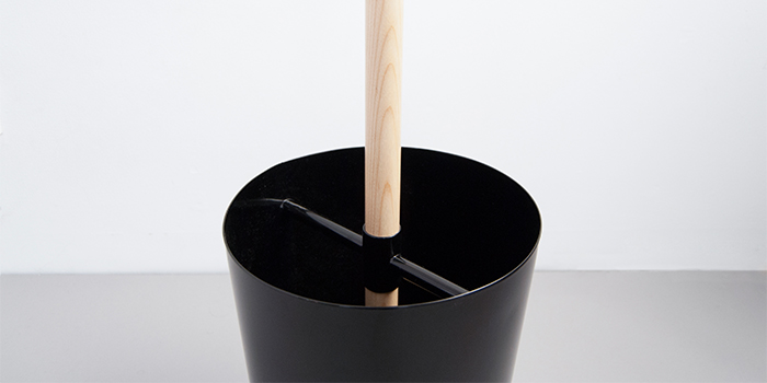
Kontextür’s first collaboration with Visibility exemplifies this ideal in the new product set to debut at WantedDesign at their third showing this May. First up is the Plus Coat Stand that pays homage to the traditional coat rack with a modern, more efficient model using wood, steel, and rubber. The coat stand utilizes the iconography of the ‘+’ and the ‘o’ signs to hang and to hold one’s coats and umbrellas. Just as the ‘+’ and ‘o’ work together to create a more efficient process of organizing, so do the materials to make a lighter, yet useful stand. This classic with a twist will show alongside two other irreverent new designs by Matt Cavanaugh and Visibility. One of the designs will be the company’s first foray into a brand new category, “Play.”
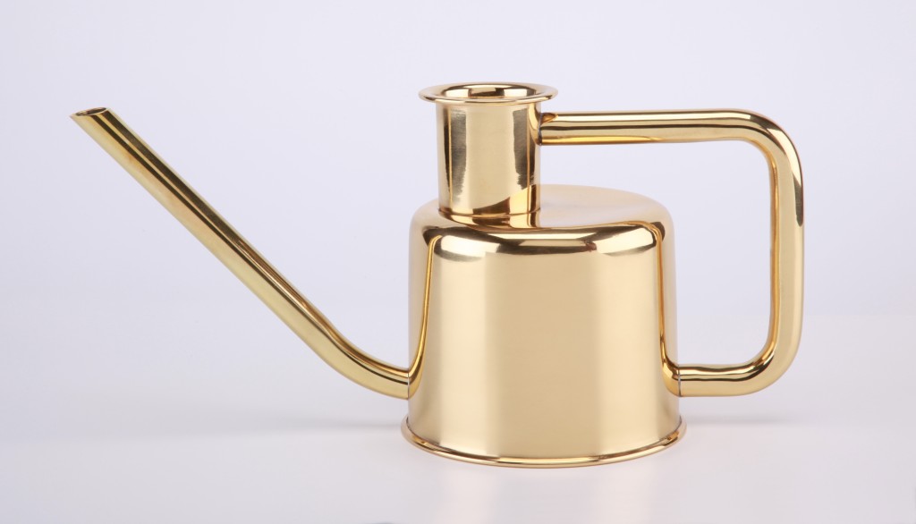
These new introductions join the likes of the WC line by Josh Owen, Viktor and Clyde by Hlynur Atlason, and the X3 Watering Can by Paul Loebach. All these pieces share one thing in common; they are utterly unexpected.
The Plus coat stand (designed for Kontextür by Visibility)

The Plus coat stand uses the iconography of the ‘+’ and the ‘o’ signs to hang and to hold one’s coats and umbrellas. This object simplifies the process of arriving home, allowing for one place to gather one’s belongings. In the same way that the ‘+’ and the ‘o’ work together, so do the materials. The wood, steel and rubber form an efficient structure allowing for lightness to combine with usefulness. The horizontal ‘+’ at the top uses rubber caps to ensure that garments stay on, deviating in form from traditional hook employing coat stands. This innovation to the archetype creates a product with new usefulness and value.

